
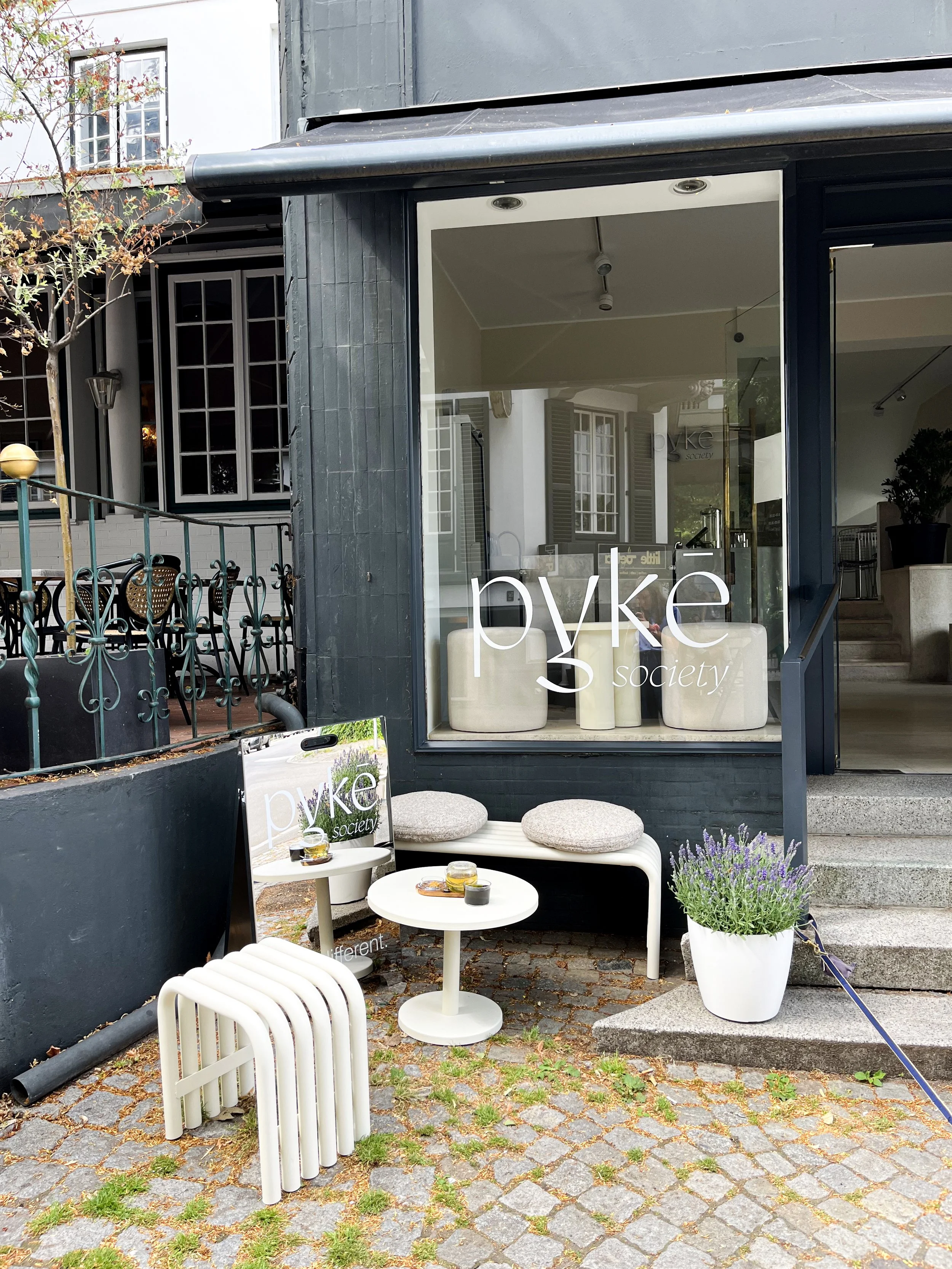
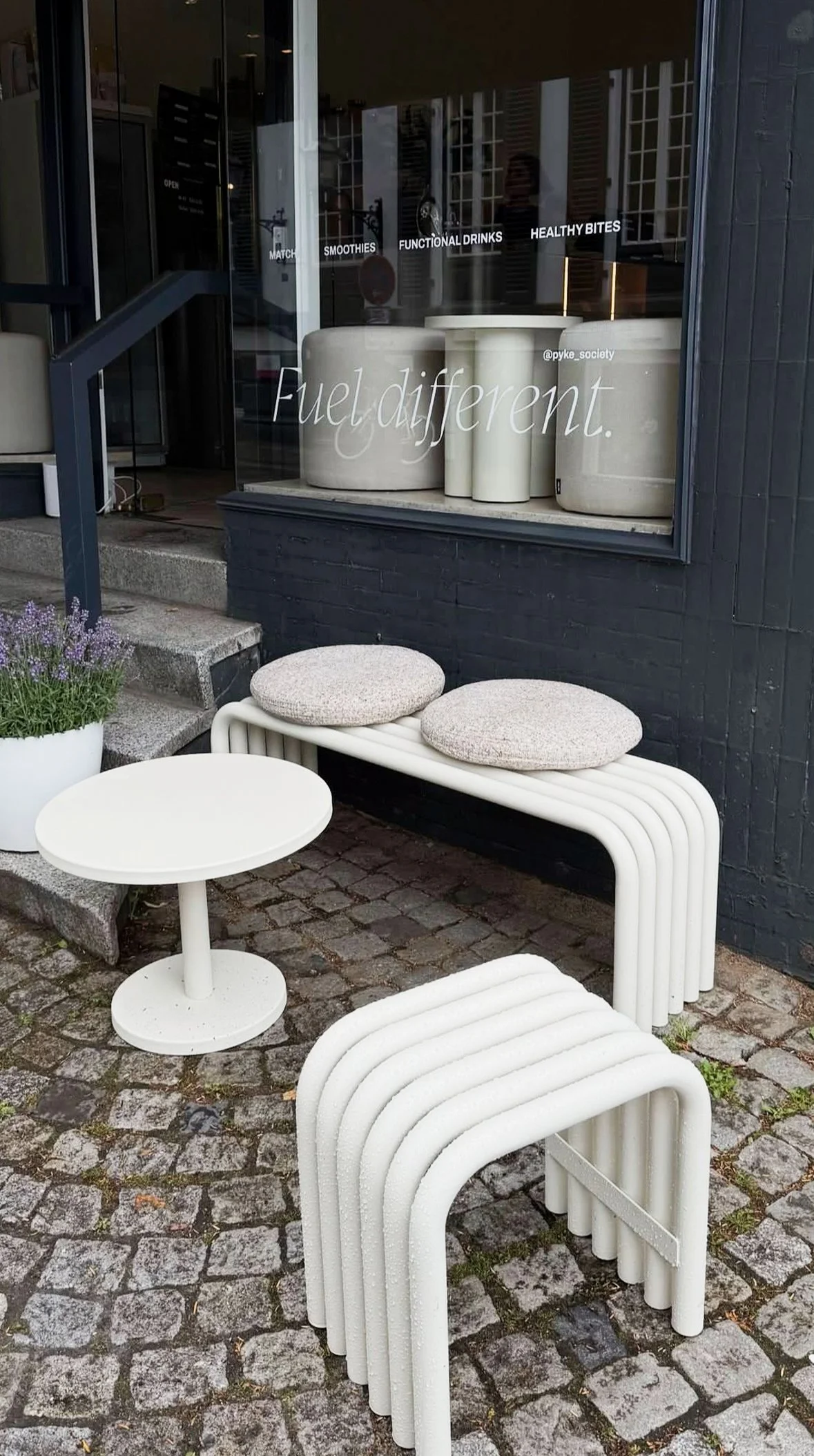
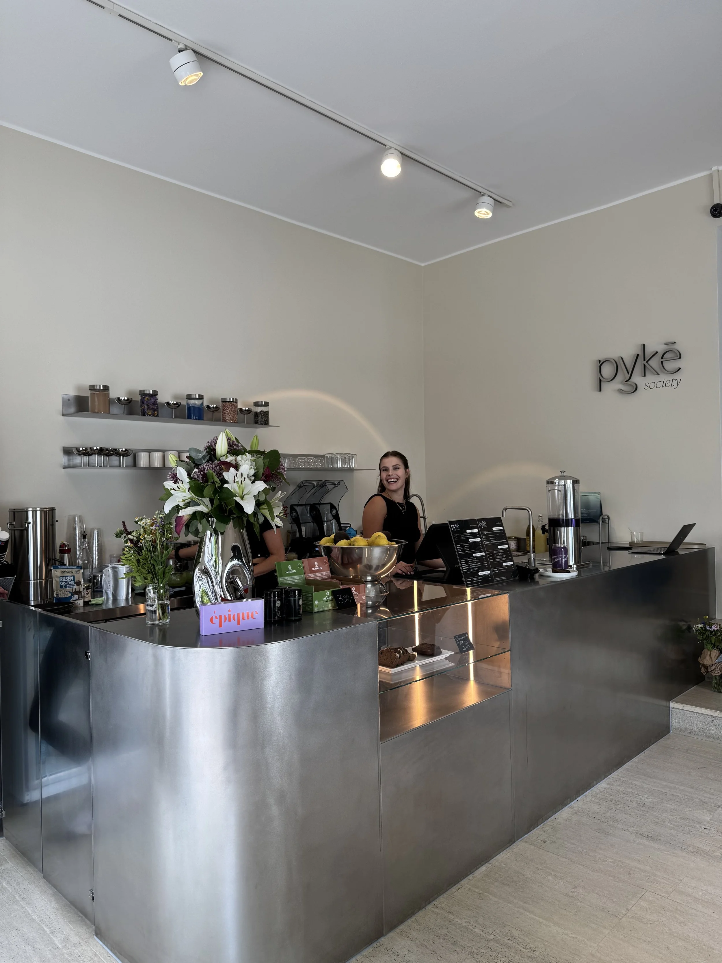
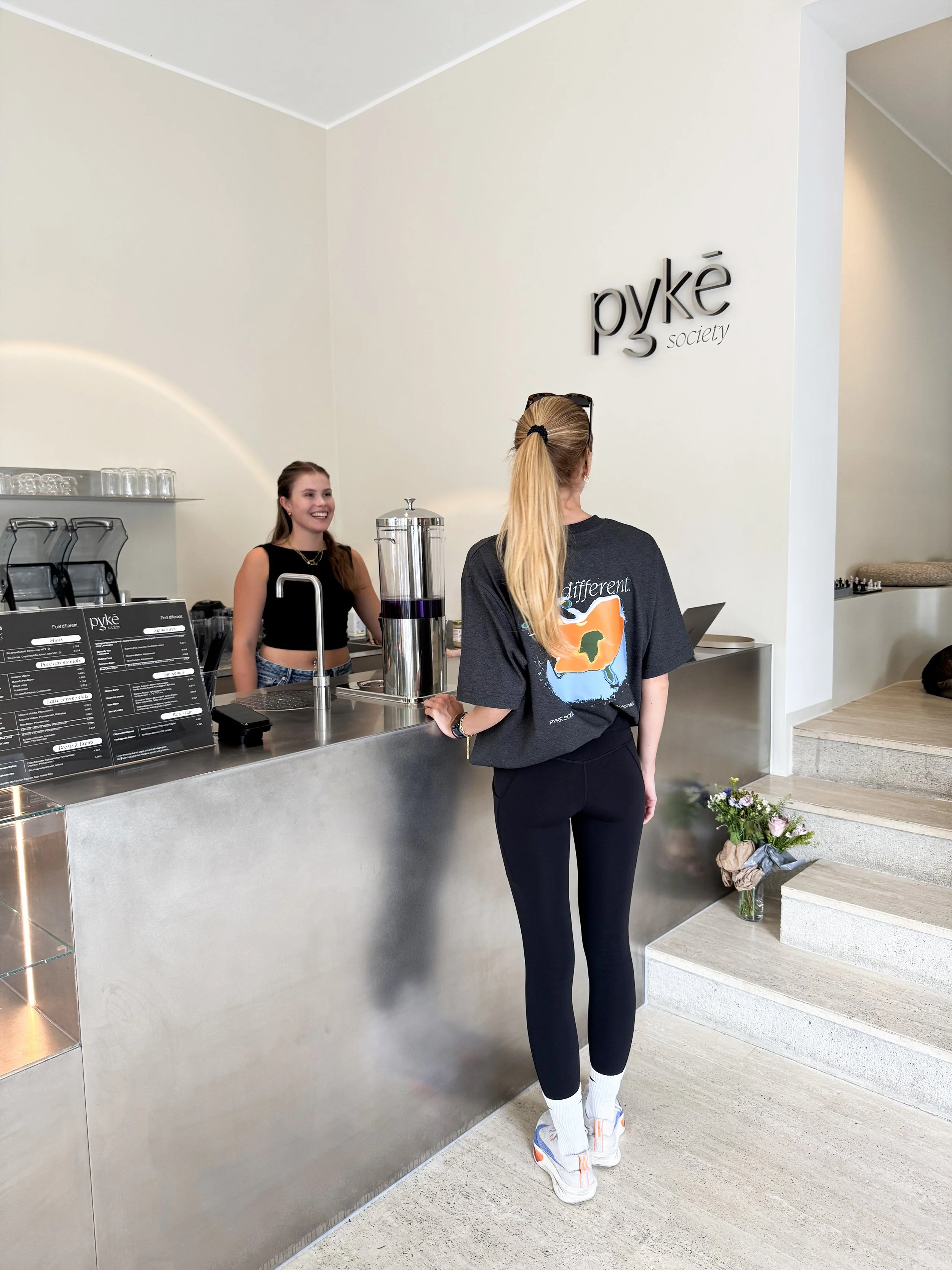
PYKE Society is a social wellness hub based in Hamburg, founded by Viviane Hecht. The place is redefining self-care by blending nourishing foods, free of refined sugar, seed oils & gluten with the shared experience within community.
PYKE Society - Fuel different
The mission of PYKE Society is to create a welcoming space where wellness becomes a shared experience—offering thoughtfully curated rituals like matcha, collagen-infused treats, red light therapy, and cold plunges to support physical vitality, hormonal balance, and mental resilience.
Inspired by founder Viviane Hecht’s own journey, PYKE empowers individuals—especially women—to take control of their health, connect with like-minded souls, and thrive together.
With the purpose to reimagine what self-care looks like by creating a space where performance meets slowness.
Born from Viviane Hecht’s personal journey of overcoming chronic health challenges and embracing the power of cycle-alignment, PYKE exists to help others to take control of their health, energy, and inner power, while spending time with a like-minded community and friends.
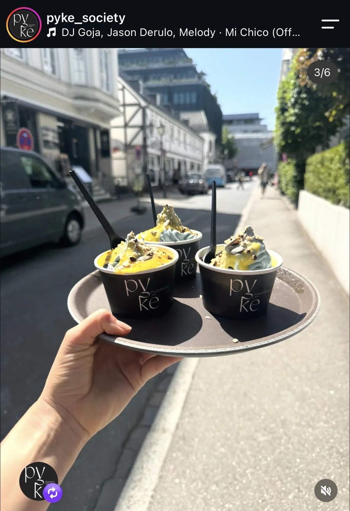
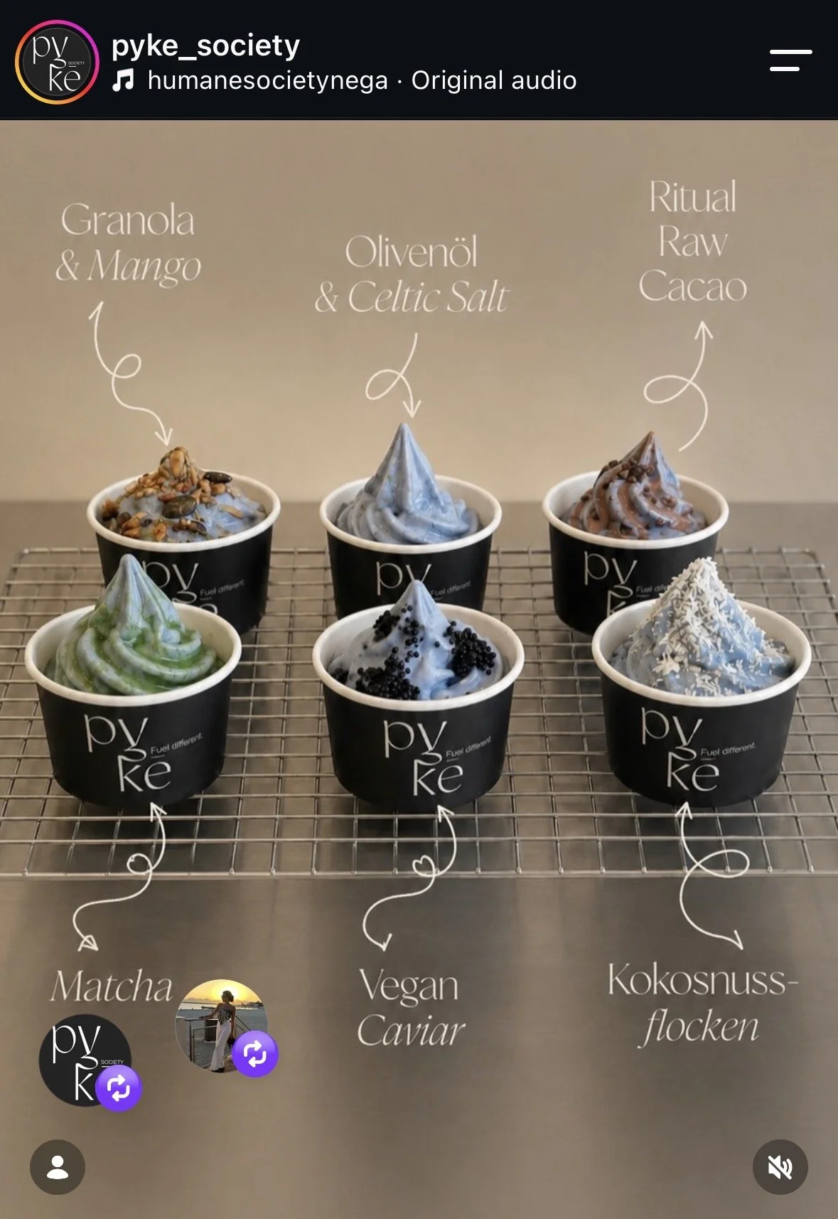
We combine nourishing rituals like matcha, collagen soft serves, and functional drinks with recovery-driven tools like cold plunges and red light therapy. PYKE is a space to connect, reset, and rise—together.
As the Brand Architect, my task was to create together with Viviane the Strategy & the Brand Identity for PYKE Society.
The goal was to create a place of nourishment & connection
The solution
Crafting a Brand whose tagline, tonality, feel & look allow for community, collaboration & feels inviting into a new concept of space, where fueling meets connecting.
-
Target Persona for PYKE Society
Vanessa - 31 years old, Hamburg-based, Interior Designer with a medium to high income.
Single
Vanessa has been working hard starting from her early twenties - her carrier is fruitful, offering her a multitude of opportunities in work, connections and financial growth. Despite her success at work, she is struggling to find the same achievements when it comes to her self-care. She is on her journey to learn how to dedicate more time to her wellbeing, mental health, rest & overall health.
She has been dealing for couple years with couple health issues caused by stress and lack of rest. Her goal is to take more time for herself and find a community that will encourage her to grow more awareness on holistic health.
Goals
• Community • Self-care • Growing while maintaining her wellbeing
Challenge
To shift from a life where she is successful despite neglecting her wellbeing, to one where her career, health, relationships, and personal growth can thrive together.
-
Brand Personality:
Happy
Peaceful
Inspiring
Focused
Powerful
Elegant
-
Approachable, Wise, and Gently Persuasive
Tone: Approachable but strong, inspiring by exemple, inteligent
Style: Elegant
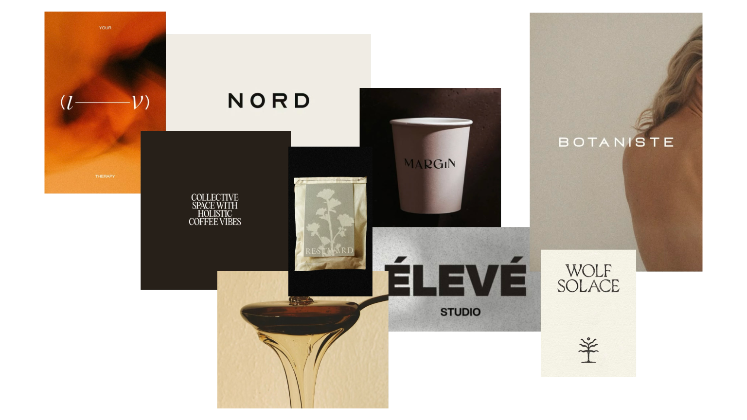
Community + Wellness + Elegance + Boldness
Brand Identity
Logotype
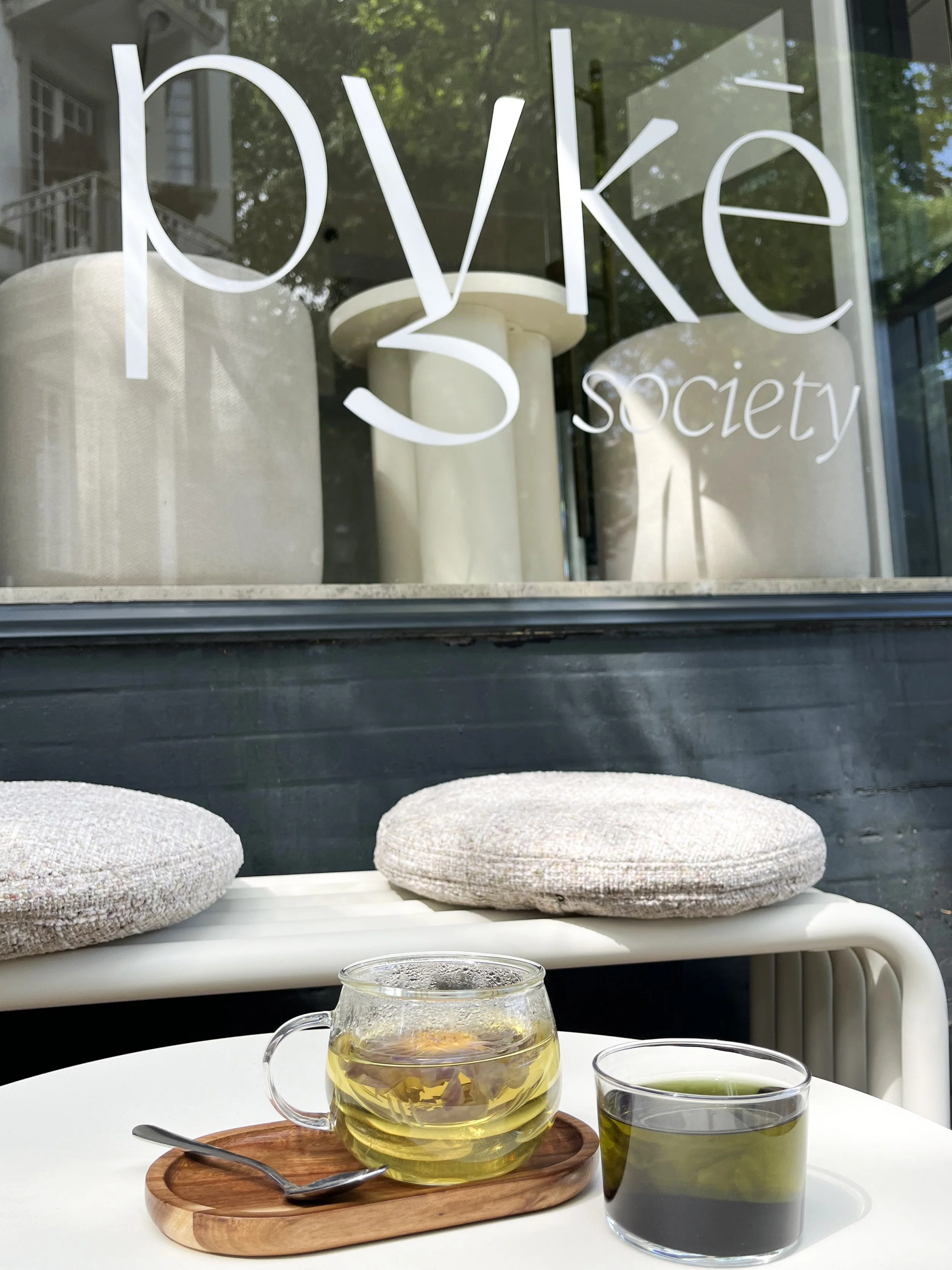
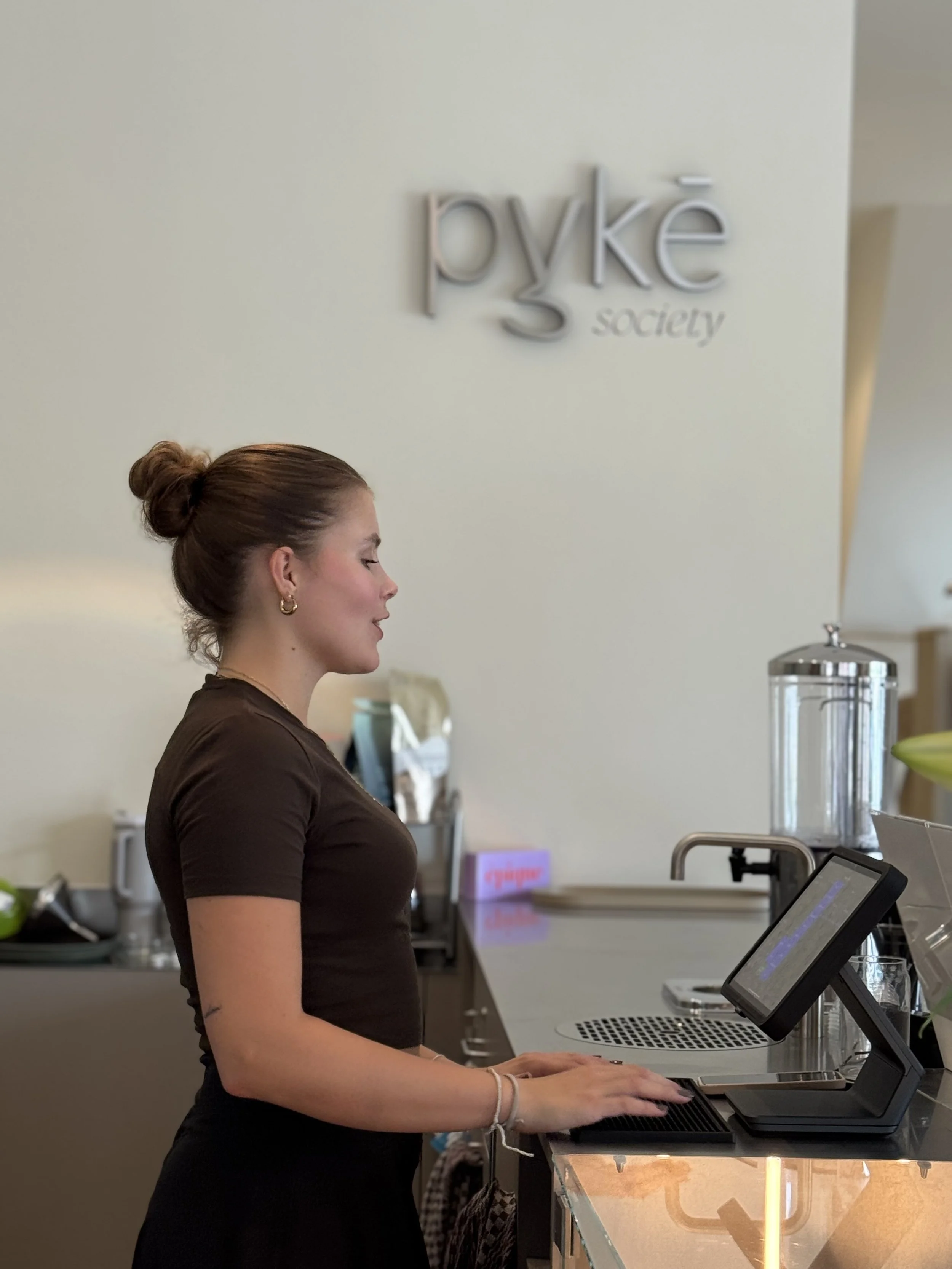
The PYKE Society custom logotype was designed to express a contemporary approach to wellness — elevated, unconventional and inherently social.
Set in an elegant, high-contrast serif, the lowercase wordmark gives the brand a sophisticated yet approachable character. The exaggerated proportions and delicate strokes create a sense of movement/growth, the elongated descender of the y adds an almost calligraphic gesture, and makes it the special element in the logotype that will be later used by the founder on different applications, bringing personality to the rather elegant logotype.
The italic word “society” is meant to accentuate the sense of PYKE being a place for community, besides a cafe.
Tagline
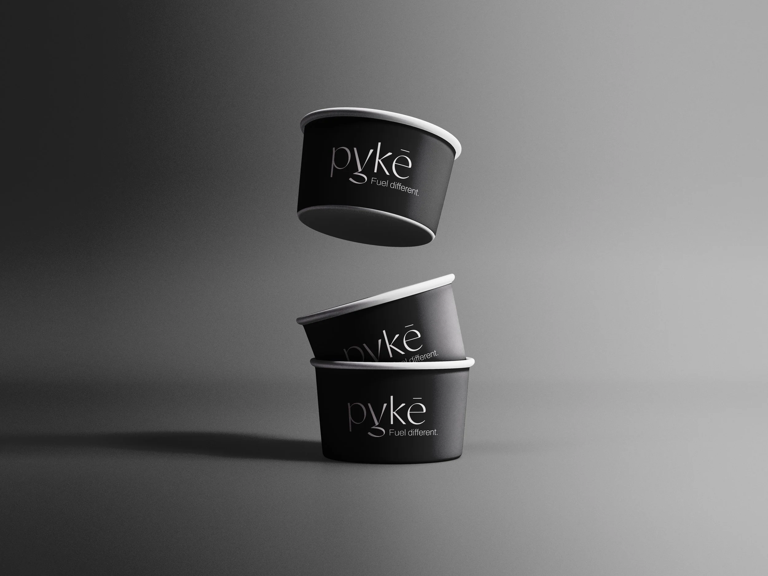
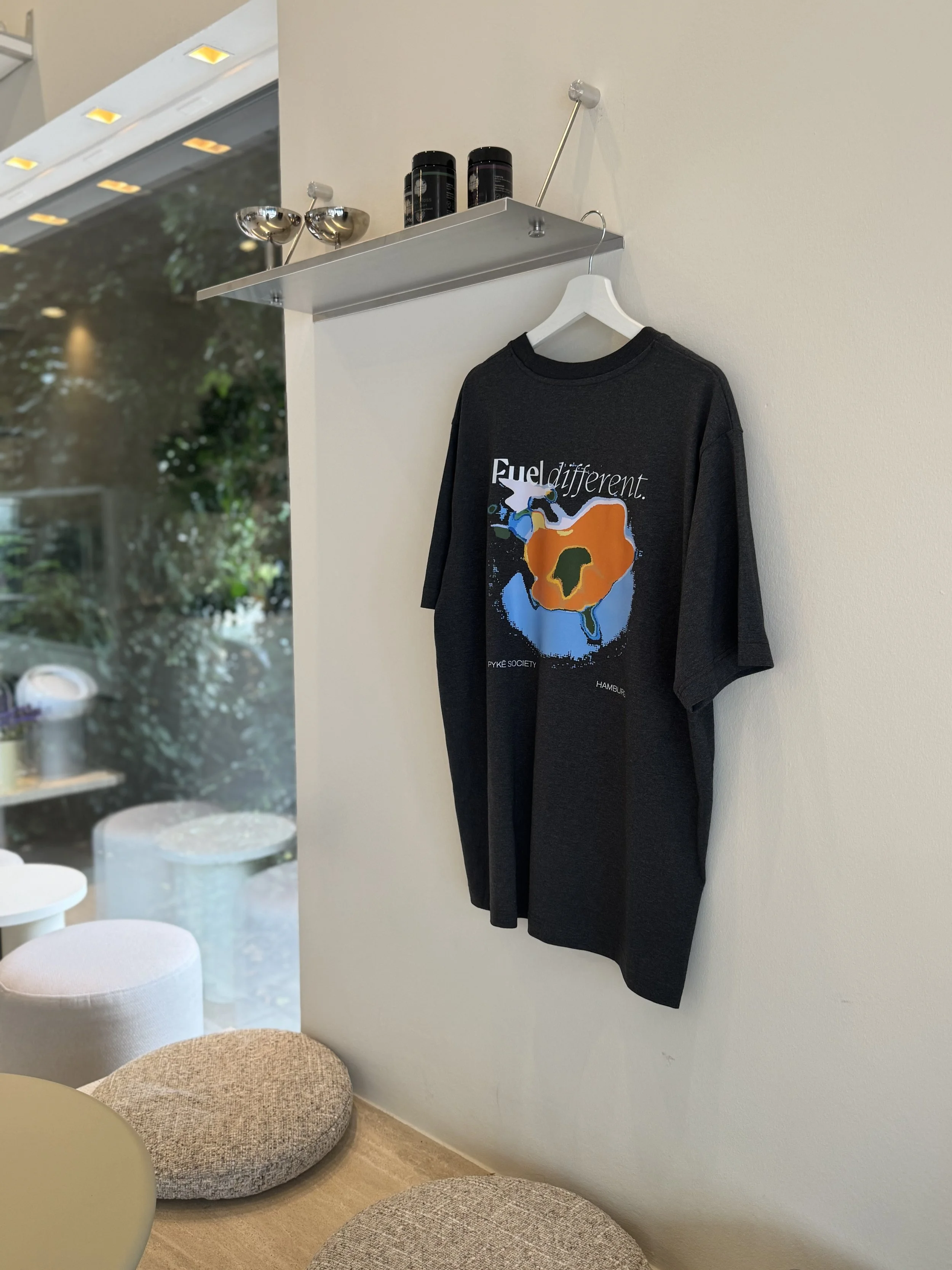
“Fuel different”
This tagline was chosen to emphasise the idea of fueling differently with PYKE Society - having a different way of getting your fuel/energy through foods and drinks that are healthy and nourishing to the body, but also in a setup and community that fuels the soul and the mind in a truly special manner.
Thank you to Viviane for the trust!
PYKE Society Instagram: https://www.instagram.com/pyke_society/?hl=en
Website: https://www.pyke-society.com